Lightroom Classic to Photoshop: Lightroom Color Mixer
Step-by-Step Guide to Using the Color Mixer in Adobe Lightroom Classic
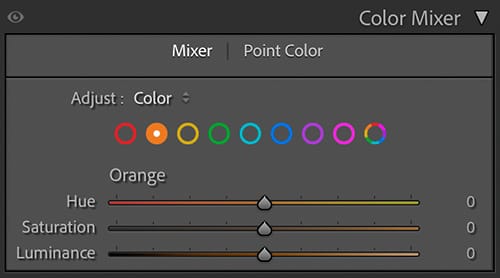
The Color Mixer in Adobe Lightroom Classic is one of the most powerful tools for controlling color in your photographs. It allows you to adjust individual colors without affecting the rest of the image, making it essential for portraits, landscapes, and creative color grading.
This step-by-step guide explains exactly how the Color Mixer works, what each control does, and how to use it effectively in a real-world editing workflow.

Step 1: Where to Find the Color Mixer
- Open your image in the Develop Module
- Scroll down to the Color Mixer panel
- Expand the panel if it is collapsed
The Color Mixer replaces the older HSL panel and combines Hue, Saturation, and Luminance into a single, more intuitive interface.
Step 2: Understanding the Color Channels
The Color Mixer is divided into eight color channels:
- Red
- Orange
- Yellow
- Green
- Aqua
- Blue
- Purple
- Magenta
Each color can be adjusted independently, giving you precise control over how specific colors appear in your image.
Step 3: Switching Between Hue, Saturation, and Luminance
At the top of the Color Mixer panel, you’ll see three options:
- Hue – Changes the actual color
- Saturation – Controls color intensity
- Luminance – Controls brightness of the color
You can click each option individually or use All to see all three controls at once.
Step 4: Using Hue Adjustments
Hue adjustments shift one color into a neighboring color.
How Hue Works
- Moving the slider left shifts the color toward one side of the spectrum
- Moving the slider right shifts it toward the opposite direction
Common Hue Adjustments
- Adjust Orange hue to fine-tune skin tones
- Shift Green hue to control foliage color
- Modify Blue hue to adjust sky color
Best Practices
- Make small adjustments
- Watch for unnatural color shifts
- Focus on one color at a time
Step 5: Using Saturation Adjustments
Saturation controls how vivid or muted a color appears.
How Saturation Works
- Increase saturation to make a color stronger
- Decrease saturation to mute or reduce color intensity
Common Uses
- Boost Blue saturation for skies
- Reduce Yellow saturation to control highlights in grass
- Slightly reduce Red saturation to avoid harsh skin tones
Avoid over-saturating, as it can quickly make images look unrealistic.
Step 6: Using Luminance Adjustments
Luminance controls how light or dark a specific color appears.
Why Luminance Is Important
- Brightening colors can add emphasis
- Darkening colors can add depth and contrast
Practical Examples
- Darken Blue luminance for richer skies
- Brighten Orange luminance for healthier skin tones
- Darken Green luminance to add depth to landscapes
Luminance is often more powerful and subtle than saturation.
Step 7: Using the Targeted Adjustment Tool (TAT)
The Targeted Adjustment Tool allows you to adjust colors directly by clicking and dragging on the image.
How to Use It
- Click the small circle icon in the Color Mixer panel
- Click on the color in the image
- Drag up or down to increase or decrease the adjustment
Lightroom automatically adjusts the relevant color sliders based on your selection.
Step 8: Using the All View for Color Balance
Selecting All shows Hue, Saturation, and Luminance sliders together for each color.
Why Use All View
- Helps maintain balance between adjustments
- Makes it easier to avoid extreme edits
- Allows quick comparisons across colors
This is especially helpful when fine-tuning an image.
Step 9: Combining the Color Mixer with Masks
For more precise control, the Color Mixer works best when combined with masking tools:
- Adjust sky colors using masks plus Color Mixer
- Fine-tune skin tones after People Masking
- Control background colors independently from subjects
This combination produces professional-level results without leaving Lightroom Classic.
Step 10: Resetting and Comparing Adjustments
- Double-click any slider to reset it
- Toggle the Color Mixer panel on and off to compare changes
- Use the ** key to compare before and after views
This helps ensure your color work enhances the image without overpowering it.
Common Mistakes to Avoid
- Over-saturating colors
- Making large hue shifts
- Ignoring luminance adjustments
- Editing colors before setting global exposure and white balance
Recommended Workflow Order
- Set white balance and exposure
- Apply global contrast adjustments
- Use the Color Mixer for color refinement
- Apply masks if needed
- Final review and export
Final Thoughts
The Color Mixer in Adobe Lightroom Classic gives photographers precise, creative control over individual colors. By understanding how Hue, Saturation, and Luminance work together—and by making subtle, intentional adjustments—you can dramatically improve the color quality of your images.
With practice, the Color Mixer will become one of the most valuable tools in your Lightroom Classic workflow.


