Mastering the Tone Curve, Color Mixer, Color Grading, and Detail in Adobe Lightroom Classic

Mastering the Tone Curve, Color Mixer, Color Grading, and Detail in Adobe Lightroom Classic
Here’s a detailed explanation of how to use the Tone Curve, Color Mixer, Color Grading, and Detail panels in Adobe Lightroom Classic for a blog post.
Adobe Lightroom Classic is a powerful tool for photographers to bring their images to life. To elevate your edits, it’s essential to understand the nuances of the Tone Curve, Color Mixer, Color Grading, and Detail panels. Here’s a comprehensive guide to help you unlock their full potential.
1. The Tone Curve: Adjusting Contrast and Tonal Balance
The Tone Curve is one of Lightroom’s most powerful tools for fine-tuning brightness and contrast. It’s divided into two sections: Point Curve and Parametric Curve.
Point Curve
- Highlights, Lights, Darks, Shadows: This curve works on specific tonal ranges.
- Drag the curve upwards to brighten or downwards to darken.
- To create a custom S-curve:
- Click on the line to add anchor points.
- Pull the highlights up slightly to make them brighter.
- Push the shadows down to deepen the contrast.
Parametric Curve
- Located below the graph, it allows for simpler adjustments using sliders.
- Adjust the Highlights, Lights, Darks, and Shadows sliders for more intuitive control.
Pro Tip: For cinematic contrast, create a faded look by lifting the bottom-left point of the curve (shadows) slightly upward.
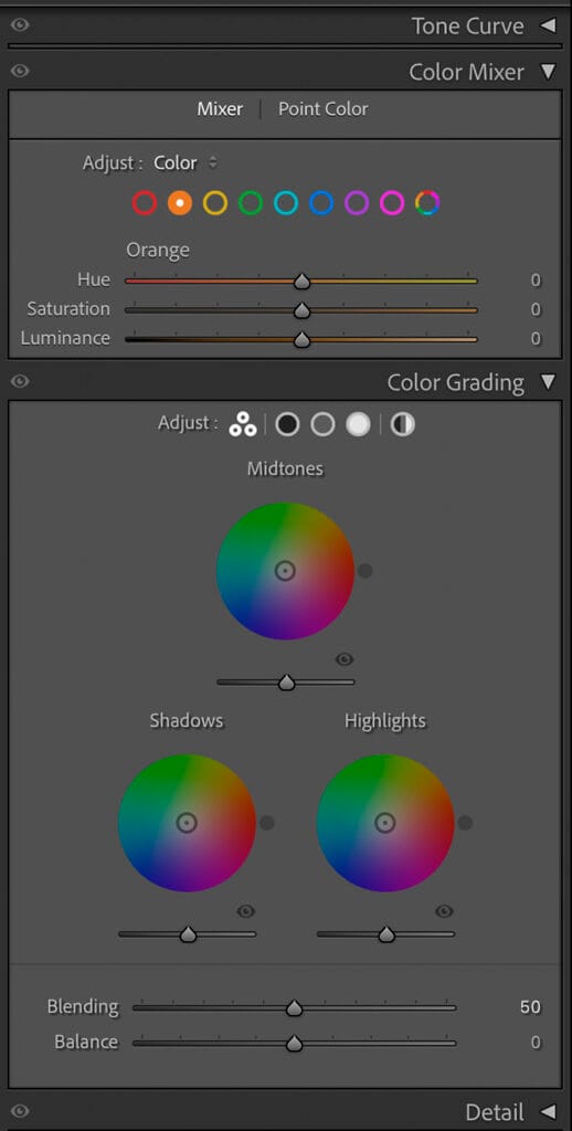
2. The Color Mixer: Fine-Tuning Colors
The Color Mixer gives you granular control over individual colors in your image. It’s divided into Hue, Saturation, and Luminance (HSL).
Hue
- Adjust the color tone. For example, make greens more yellow or reds more orange.
- Use the Targeted Adjustment Tool (TAT) to click and drag on specific areas of the image to adjust their hue.
Saturation
- Control the intensity of each color. Reduce saturation for muted tones or increase it for vibrancy.
- Be cautious with skin tones—over-saturation can lead to unnatural results.
Luminance
- Adjust the brightness of each color. For instance:
- Brighten the blues for vibrant skies.
- Darken greens for a moody forest feel.
Pro Tip: Use the Color Mixer to create consistent color palettes by desaturating or luminizing specific hues.
3. Color Grading: Adding Mood and Style
Color Grading allows you to apply color tones to Shadows, Midtones, and Highlights, giving your image a cinematic or stylized look.
The Basics
- Shadows: Add a subtle blue or green tone for a dramatic, cold effect.
- Midtones: Use warm tones (orange or yellow) to enhance skin tones or sunlight.
- Highlights: Apply soft yellows or reds for a golden-hour glow.
Global Adjustment
- Use the global color wheel to apply a uniform tint across the entire image.
Blending and Balance
- Blending: Adjusts how much overlap exists between shadows, midtones, and highlights.
- Balance: Prioritizes either shadows or highlights for your chosen tones.
Pro Tip: Keep adjustments subtle to avoid an overly processed look. Use color grading to enhance the mood rather than overpower the image.
4. Detail: Sharpening and Noise Reduction
The Detail panel ensures your images are crisp and clean, especially after heavy edits.
Sharpening
- Amount: Controls the overall strength of sharpening.
- Radius: Determines the size of edges to sharpen. Use smaller values for fine details.
- Detail: Focuses sharpening on textures rather than edges.
- Masking: Hold Alt (Windows) or Option (Mac) while dragging to see which areas will be sharpened. This helps avoid sharpening unwanted areas like skies.
Noise Reduction
- Luminance Noise Reduction: Smoothens grain in low-light images while retaining details.
- Color Noise Reduction: Eliminates colored speckles in noisy images.
- Keep noise reduction subtle to avoid a plasticky look.
Pro Tip: Balance sharpening and noise reduction to retain detail without introducing artifacts.
Workflow Tips
- Start with the Tone Curve: Define your image’s tonal balance and contrast.
- Fine-Tune Colors: Use the Color Mixer for precise color adjustments.
- Add Style: Use Color Grading to set the mood of the image.
- Finalize with Detail: Ensure your image is sharp and noise-free.
By mastering these tools, you’ll have the confidence to transform your photos into stunning works of art. Experiment, practice, and let your creativity flow!
Would you like me to expand on any of these sections or provide additional tips for specific use cases?