Easily Master Photoshop Adjustments Window

Master Photoshop Adjustments Window
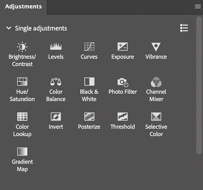
Photoshop adjustments offer a range of tools that allow you to refine and enhance your images by altering various aspects like color, tone, contrast, and brightness. These adjustments give you the flexibility to correct imperfections, create specific moods, and bring out details in a way that aligns with your creative vision. By manipulating these elements, you can transform a dull image into something vibrant, shift the overall color balance to achieve a more natural look, or even completely change the atmosphere of a scene. Adjustments are integral to the editing process, enabling you to achieve both subtle corrections and dramatic effects, depending on your goals.
Easily Master Photoshop Adjustments Window
1. Brightness/Contrast-The Brightness/Contrast adjustment lets you make simple adjustments to the tonal range of an image. Moving the brightness slider to the right increases tonal values and expands image highlights, to the left decreases values and expands shadows. The contrast slider expands or shrinks the overall range of tonal values in the image.
In normal mode, Brightness/Contrast applies proportionate (nonlinear) adjustments to the image layer, as with Levels and Curves adjustments. When Use Legacy is selected, Brightness/Contrast simply shifts all pixel values higher or lower when adjusting brightness. Since this can cause clipping or loss of image detail in highlight or shadow areas, using Brightness/Contrast in Legacy mode is not recommended for photographic images (but can be useful for editing masks or scientific imagery).
2. Levels-You use the Levels adjustment to correct the tonal range and color balance of an image by adjusting intensity levels of image shadows, midtones, and highlights. The Levels histogram is a visual guide for adjusting the image key tones.
3. Curves-In the Curves adjustment, you adjust points throughout an image’s tonal range. Initially, the image’s tonality is represented as a straight diagonal line on a graph. When adjusting an RGB image, the upper-right area of the graph represents the highlights and the lower-left area represents the shadows. The horizontal axis of the graph represents the input levels (original image values) and the vertical axis represents the output levels (new adjusted values). As you add control points to the line and move them, the shape of the curve changes, reflecting your image adjustments. The steeper sections of the curve represent areas of higher contrast while flatter sections represent areas of lower contrast.
4.Exposure-used to make exposure, offset and gamma corrections. I can’t find a definition by adobe. Essentially, it is similar to levels and curves.
5. Vibrance-Vibrance adjusts the saturation so that clipping is minimized as colors approach full saturation. This adjustment increases the saturation of less-saturated colors more than the colors that are already saturated. Vibrance also prevents skin tones from becoming over saturated.
6. Hue/Saturation-Hue/Saturation lets you adjust the hue, saturation, and lightness of a specific range of colors in an image or simultaneously adjust all the colors in an image. This adjustment is especially good for fine-tuning colors in a CMYK image so that they are in the gamut of an output device.
7. Color Balance-Color balance can be used to correct color imperfections in your image. You can also use color balance to create dramatic effects by changing the overall mixture of colors used in your composite. Photo Filter is another option that lets you apply a hue adjustment to your image.
8. Black&White-converts a color image to black and white. You adjust each colors black and white value. You must still convert to grayscale it you want a true black and white image.
9. Photo Filter-Photo Filter adjustments mimic the technique of placing a colored filter in front of your camera lens to adjust the color balance and temperature of the light transmitted through the lens and exposing the film.
10. Channel Mixer-Using the Channel Mixer adjustment, you can create high-quality grayscale, sepia tone, or other tinted images. You can also make creative color adjustments to an image. To create high-quality grayscale images, choose the percentage for each color channel in the Channel Mixer adjustment. To convert a color image to grayscale and add tinting to the image, use the Black & White command.
11. Color Lookup-use Luts to colorize or give a specific look to your image. Luts are used in video all the time.
12. Invert-converts a positive to a negative or a negative to a positive.
13. Posterize-The Posterize adjustment lets you specify the number of tonal levels (or brightness values) for each channel in an image and then maps pixels to the closest matching level. For example, choosing two tonal levels in an RGB image gives six colors: two for red, two for green, and two for blue.
This adjustment is useful for creating special effects, such as large, flat areas in a photograph. Its effects are most evident when you reduce the number of gray levels in a grayscale image, but it also produces interesting effects in color images.
14. Threshold-The Threshold adjustment converts grayscale or color images to high-contrast, black-and-white images. You can specify a certain level as a threshold. All pixels lighter than the threshold are converted to white; all pixels darker are converted to black.
15. Selective Color-Selective color correction is a technique used by high-end scanners and separation programs to change the amount of process colors in each of the primary color components in an image. You can modify the amount of a process color in any primary color selectively—without affecting the other primary colors. For example, you can use selective color correction to dramatically decrease the cyan in the green component of an image while leaving the cyan in the blue component unaltered.
Even though Selective Color uses CMYK colors to correct an image, you can use it on RGB images.
16. Gradient Map-The Gradient Map adjustment maps the equivalent grayscale range of an image to the colors of a specified gradient fill. If you specify a two‑color gradient fill, for example, shadows in the image are mapped to one of the endpoint colors of the gradient fill, highlights are mapped to the other endpoint color, and midtones are mapped to the gradations in between.
Using the Info Window

Above is an example of skin tone readings. All “K” readings were taken inside the red circles. It takes time and practice to understand the different “K” values in skies, skin tones, etc. “K” stands for percentage of black in the image using 8 bits. All skin tones vary, but this should get you started.