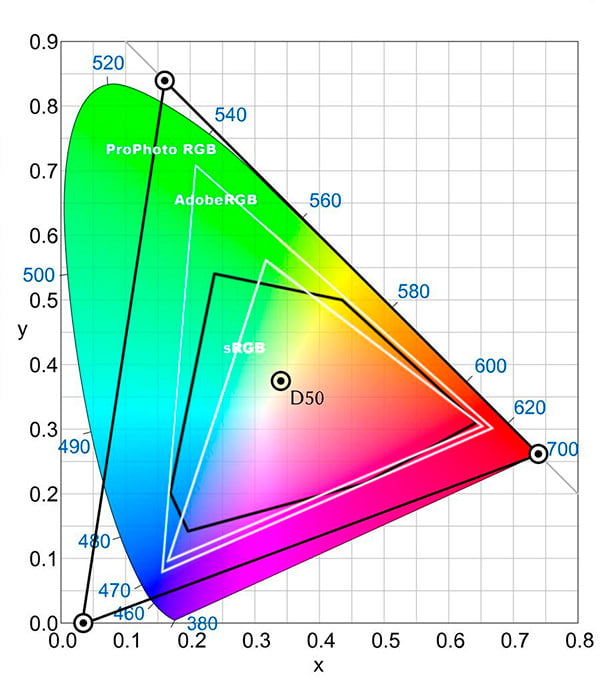
Understanding Color Management, Color Gamuts, and Color Spaces: sRGB, Adobe RGB (1998), and ProPhoto

Understanding Color Management, Color Gamuts, and Color Spaces: sRGB, Adobe RGB (1998), and ProPhoto
Color plays a critical role in how we perceive the world, especially in photography, design, and video production. Whether you’re an amateur photographer or a seasoned designer, understanding color management, color gamuts, and color spaces is essential for producing accurate and vibrant images. This blog post will explore these concepts and explain the differences between the popular color spaces: sRGB, Adobe RGB (1998), and ProPhoto RGB.
What is Color Management?
Color management is the process of ensuring that colors are consistent and accurate across different devices, such as cameras, monitors, printers, and mobile screens. Without proper color management, the colors you see on your monitor may look entirely different when printed or viewed on another device.
Color management systems (CMS) are responsible for translating colors between devices using *ICC profiles* (International Color Consortium profiles). These profiles describe how a device interprets color, allowing it to display or print colors as accurately as possible. The ultimate goal is to maintain color consistency throughout the entire workflow, from image capture to final output.
What are Color Gamuts?
The term *color gamut* refers to the range of colors that a device or color space can represent. You can think of it as a subset of all visible colors. A device with a wider color gamut can display or reproduce more colors, while a smaller gamut will limit the range of colors available.
For instance, your computer monitor might have a certain color gamut, while your printer has another. If the printer’s color gamut is smaller than the monitor’s, some colors won’t reproduce as accurately when printed. This is where color management steps in to make the best possible translation between different gamuts.

What are Color Spaces?
A *color space* is a specific organization of colors that defines the color gamut for a particular use case. It’s a mathematical model that describes how colors can be represented using numbers, usually as combinations of three primary colors (like red, green, and blue). Common color spaces include sRGB, Adobe RGB (1998), and ProPhoto RGB.
The Difference Between sRGB, Adobe RGB (1998), and ProPhoto RGB
When working with digital images, you’ll often come across these three color spaces. Each has its strengths and is suited for different types of projects. Let’s break them down:
1. sRGB (Standard RGB)
sRGB is the most common color space and the default for most consumer devices, including cameras, monitors, and web browsers. It has a relatively small color gamut compared to Adobe RGB (1998) and ProPhoto RGB, but it’s widely accepted and ideal for digital content that will be viewed online or on standard displays.
- –Pros: Universally supported, best for web and general use, consistent across most devices.
- –Cons: Limited color gamut, not suitable for high-end printing or professional color work.
2. Adobe RGB (1998)
Adobe RGB (1998) was developed by Adobe to provide a wider color gamut than sRGB, specifically for professional photography and graphic design. This color space is often used in print work because it can represent more colors, especially in the greens and blues, making it better suited for high-quality image editing and printing.
- -Pros: Larger color gamut than sRGB, ideal for print and professional work.
- – Cons: Not all devices can display its full gamut, which may lead to inconsistencies if viewed on non-calibrated or consumer-grade screens.
3. ProPhoto RGB
ProPhoto RGB has an even larger color gamut than Adobe RGB (1998), covering nearly all visible colors. It’s often used in high-end photography and digital imaging where preserving as much color data as possible is essential. ProPhoto RGB is ideal for professional photographers who need the highest level of color fidelity, especially when working with RAW files and large-format printing.
- – Pros: Enormous color gamut, capable of preserving the maximum amount of color data.
- – Cons: Requires careful handling to avoid color banding, most consumer devices can’t display this gamut, and improper use may lead to inaccurate colors.
Choosing the Right Color Space for Your Workflow
The color space you choose depends on your project’s needs and the intended output. Here are some general guidelines:
- – For web or digital content: sRGB is the safest choice because it’s universally supported and provides consistent results across different devices.
- – For print work: Adobe RGB (1998) is the better option, as it offers a wider color gamut that is more suitable for high-quality prints.
- – For professional photography: ProPhoto RGB gives the most color detail, especially when working with RAW images, but it is overkill. The eye is unable to see part of the color spectrum, higher end monitors cannot display 1/4 of the color gamut, and printers can’t print the profile, so I use Adobe RGB (1998).
Final Thoughts
Color management, color gamuts, and color spaces are fundamental concepts in digital imaging and photography. Choosing the right color space ensures that your images appear as intended, whether viewed on a screen or printed on paper. By understanding the differences between sRGB, Adobe RGB (1998), and ProPhoto RGB, you can make informed decisions about which color space to use based on your specific needs.
Remember, while having access to a wider color gamut is beneficial for professional work, it also requires careful management to ensure accurate and consistent color reproduction across devices. The only way to achieve accurate color is to calibrate your monitor.


