Understanding Printing Color Rendering Intents

Understanding Printing Color Rendering Intents: A Guide for Photographers


When you’re preparing your photographs for print, the choices you make in printing color rendering intents can significantly impact how your images look in physical form. One of the key decisions is which printing color rendering intents to use. But what exactly is a rendering intent, and how do you choose the right one for your prints?

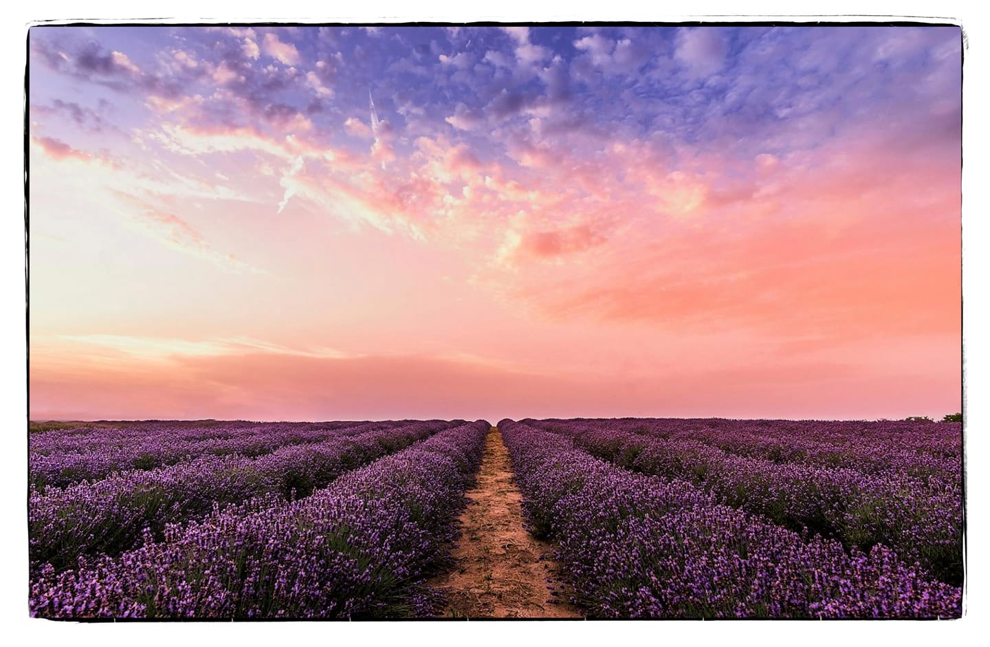
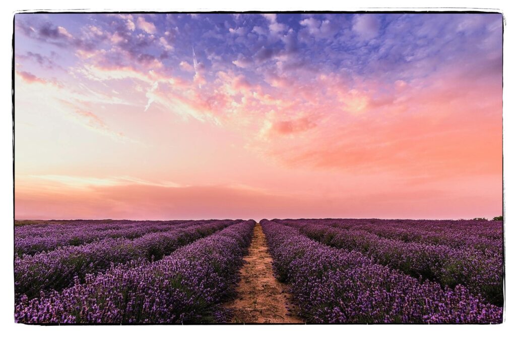
All images above were rendered using Adobe Photoshop’s Customise Proof Condition. This simulates what your image will look like printed on your computer monitor.
What Are Rendering Intents?
Rendering intents are part of the color management system in digital imaging. They dictate how colors from your image (in one color space, like your monitor) are translated into another color space (like your printer’s). The key issue is that most printers can’t reproduce the full range of colors that digital screens can display, so rendering intents help manage this limitation by deciding how to handle out-of-gamut colors.
There are four main types of rendering intents, each with unique characteristics and best-use scenarios.
1. Perceptual Rendering Intent
When to Use:
- Best for images with subtle gradations, such as landscapes or portraits.
- Great for highly saturated images where a smooth transition of colors is more important than exact accuracy.
How It Works:
Perceptual rendering compresses the entire color gamut of an image to fit within the printer’s color range. It prioritizes smooth color gradation over exact color accuracy, meaning it alters both in-gamut and out-of-gamut colors. This results in a visually pleasing print, especially for photos with lots of colors and tonal transitions, though colors may shift slightly.
Pros:
- Maintains the overall look and feel of an image.
- Smooth transition between colors, even in very colorful images.
Cons:
- Less accurate for specific colors.
2. Relative Colorimetric Rendering Intent
When to Use:
- Ideal for high-contrast images with bold, bright colors.
- Great for artwork or photographs where color accuracy matters, especially when only a small portion of the image is out of gamut.
How It Works:
This intent keeps all in-gamut colors the same, and only adjusts the out-of-gamut colors to fit the printer’s color space. In essence, it tries to render most of the image accurately, only modifying areas that can’t be printed.
Pros:
- Accurate color representation for in-gamut colors.
- Minimal changes to the original image.
Cons:
- Can cause sharp shifts in color, especially in highly saturated images, as out-of-gamut colors are abruptly adjusted.
3. Saturation Rendering Intent
When to Use:
- Primarily for charts, graphs, and non-photographic work where vividness is more important than color accuracy.
How It Works:
The saturation rendering intent focuses on maintaining the vividness or saturation of colors, even if it sacrifices some color accuracy. This intent is not typically used for photography because it can distort colors, but it’s great for business graphics where punchy, bold colors are the priority.
Pros:
- Delivers vivid, bright colors.
Cons:
- Poor accuracy for photos, often leading to unrealistic color representation.
4. Absolute Colorimetric Rendering Intent
When to Use:
- Best for simulating how an image would look on a different type of paper or under different lighting conditions.
- Ideal when you want exact color matching from one medium to another (e.g., soft proofing).
How It Works:
This intent preserves the absolute color values, including the white point of the source image, meaning it doesn’t account for the paper’s color. This can be useful for proofing prints on different types of media, as it attempts to reproduce colors as closely as possible to how they appear on the original medium.
Pros:
- Excellent for color matching across different mediums.
- Precise color reproduction in certain cases.
Cons:
- Can create strange effects if the paper’s color doesn’t match the source white point.
How to Choose the Right Rendering Intent
Choosing the right rendering intent for your photos depends on your priorities. If you need accurate colors, especially for in-gamut areas, Relative Colorimetric is usually your best option. For smooth transitions and a more natural look, Perceptual is the way to go. If you’re working with bold designs rather than photographs, Saturation may give you the punch you’re looking for. Finally, Absolute Colorimetric is most useful in color matching scenarios or when proofing prints.
Final Thoughts
Understanding the role of rendering intents in printing is crucial for photographers who want their images to look as good on paper as they do on screen. While the default rendering intent may work for many images, knowing when and why to switch can help you achieve better, more consistent print results. Before sending your photos to the printer, take a moment to evaluate which intent will best suit your creative vision and the printing medium.
Happy printing!
Feel free to share your thoughts or experiences with color rendering intents in the comments below!


