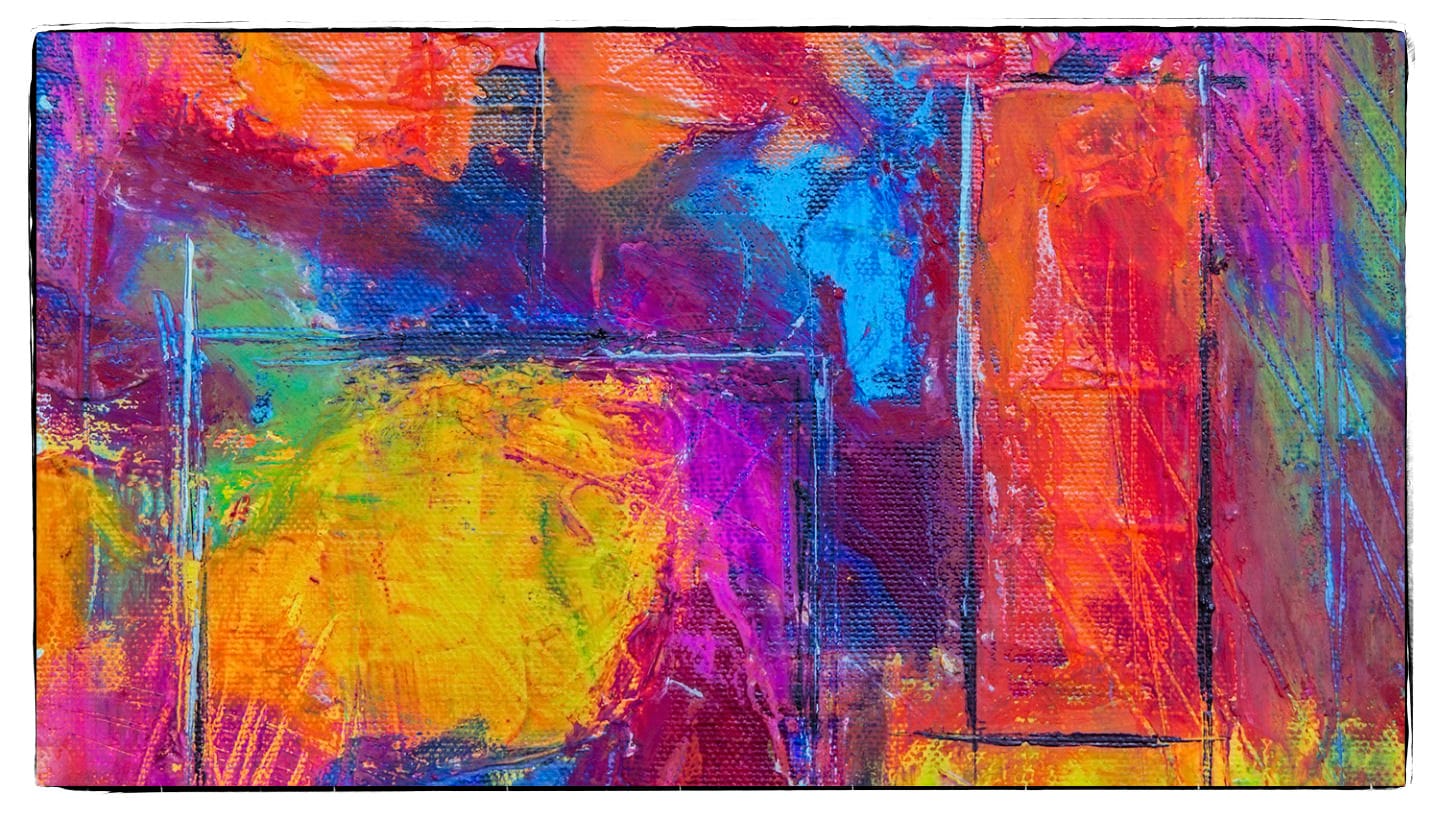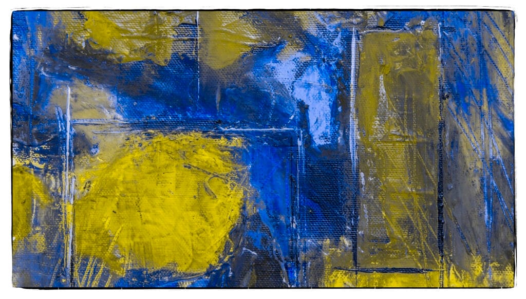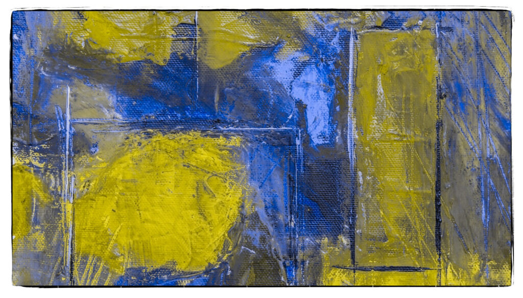


Photoshop Proofing for Protanopia and Deuteranopia Color Blindness
Photoshop has two color blindness proofing options designed to help ensure that designs are accessible to individuals with color vision deficiencies. These options simulate how your work will appear to people with specific types of color blindness:
- Protanopia (Red-Blind) Simulation
Protanopia is a type of red-green color blindness where red cones are missing in the eye, making it difficult to distinguish between red and green shades. When you use this option, Photoshop will simulate how your design looks to someone with this type of deficiency, helping you adjust your design for better clarity and accessibility. - Deuteranopia (Green-Blind) Simulation
Deuteranopia is another form of red-green color blindness, but this time it’s caused by a lack of green cones. This makes it hard to differentiate between green and red hues. Like the Protanopia simulation, this tool shows how your design would appear to someone with Deuteranopia.
How to Use the Photoshop Proofing Color Blindness Options
- Open your project in Photoshop.
- Go to the View menu on the top bar.
- Navigate to Proof Setup > Color Blindness.
- You will see two options:
- Protanopia-type: Select this to simulate red-blind color vision.
- Deuteranopia-type: Select this to simulate green-blind color vision.
- Once selected, Photoshop will immediately adjust your image view to simulate how it would look to a person with that type of color blindness.
By cycling between these options, you can ensure that your design is clear and legible to a wider audience. Adjusting contrast, color combinations, and brightness may help improve visibility for those affected by color blindness.
Tips on Editing in Photoshop if you are Color Blind
If you’re color blind and working with images in Adobe Photoshop, there are several techniques and tools you can use to ensure accurate color adjustments even without perfect color vision.
1. Use Grayscale and Luminance for Contrast
Relying on grayscale helps you adjust brightness and contrast without worrying about color differentiation. Here’s how to use it:
- Convert to Grayscale Temporarily:
- Go to Image > Mode > Grayscale to temporarily view your image in black and white. This lets you focus on contrast without the distraction of color.
- After adjusting contrast, you can revert to RGB by going to Image > Mode > RGB Color.
- Use Luminance Values:
- Use adjustment layers like Brightness/Contrast or Levels to make changes based on the lightness or darkness of the image instead of color.
2. Use Color Labels and Numeric Values
- Info Panel: Open the Info Panel by going to Window > Info. This panel shows the numeric values of colors in your image (RGB or CMYK values), helping you make precise adjustments.
- For example, a pure red color would have an RGB value of (255, 0, 0), while a pure green would be (0, 255, 0).
- Eyedropper Tool: Use the Eyedropper Tool to sample colors in your image and see their exact values. This is especially helpful if you cannot distinguish between colors visually.
3. Utilize Color Blindness Simulators
Photoshop has built-in simulators that let you preview how your image looks to people with various types of color blindness (Protanopia and Deuteranopia):
- Go to View > Proof Setup > Color Blindness and toggle between the Protanopia-type and Deuteranopia-type settings.
- Even if you’re color blind, you can see how others with different types of color blindness will view your work.
4. Work with Color Schemes
Using simple and contrasting color schemes can help you design more confidently.
- Pre-made color palettes: Tools like Adobe Color provide accessible palettes and schemes that are specifically designed for color-blind individuals.
- Monochromatic or analogous colors: These can be easier to manage since you’re primarily adjusting shades and lightness rather than complex color contrasts.
5. Use Hue/Saturation Adjustment Layers
These adjustment layers let you manipulate the color properties of an image with more control:
- Go to Layer > New Adjustment Layer > Hue/Saturation.
- Adjust the lightness slider to control how bright or dark certain colors are without needing to distinguish between them visually.
- Use the Hue slider to shift colors in broad groups (e.g., reds, greens, blues) until you achieve a balanced look.
6. Use Plugins and Tools for Color Blindness
There are third-party plugins and tools available that help people with color blindness adjust colors more accurately:
- Color Oracle: A free tool that simulates color blindness across platforms.
- Sim Daltonism: A real-time color blindness simulator for Mac.
7. Use Accessible Design Principles
If you work with design or image editing, keep in mind that accessible design can help you as well as others with color vision deficiencies:
- Increase Contrast: Higher contrast between elements ensures clarity.
- Avoid Relying on Color Alone: Use patterns, textures, or text labels to distinguish elements instead of relying solely on color differences.
By using a combination of these methods, you can adjust images effectively even if you have a color vision deficiency.


