SHUTTER BUG ACADEMY · JOHN WHITEHEAD
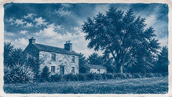
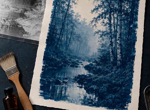
A cyanotype, salt print, or platinum/palladium print begins with a simple relationship: the negative controls how much light reaches the sensitized paper. You can make that negative in a camera, enlarge it in a darkroom, or print it from a digital file. Each route offers different ways to control size, detail, and contrast.
The best negative is the one matched to the printing process. A beautiful negative on a light table—or a convincing inverted image on a monitor—may still produce a weak print. This guide compares the three routes and explains how to test them.
What these three approaches have in common
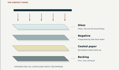
In contact printing, the negative rests against the sensitized surface. There is no enlargement during this exposure. A 4 × 5-inch image on film makes a 4 × 5-inch contact image; an 8 × 10-inch image requires a negative of that size, regardless of the paper border.
Clearer negative areas transmit more light and generally become darker in the print. Denser areas block more light and become lighter. Between them, intermediate densities must preserve the photograph’s middle tones.
For UV-sensitive methods, visible darkness is only a rough guide. Film base, silver density, developer stain, and printer inks can transmit ultraviolet light differently. The actual contact print is the deciding test.
THREE ROUTES TO A CONTACT NEGATIVE Different preparation. The same final printing stage.
01 CAMERA FILM Expose sheet film↓Develop for the process↓Fix, wash and dryContact image staysthe size of the original.
02 DARKROOM COPY Original negative↓Make a film interpositive↓Enlarge onto copy filmProcess copy film for tones;the copy sets the print size.
03 INKJET NEGATIVE Digital photo or film scan↓Edit and apply calibration↓Print on transparencyPrint at final image size;let the ink cure.
CONTACT PRINT Negative + sensitized paper → expose → process for the chosen methodDarkroom route shown: small interpositive first, then an enlarged negative.Three negative-making routes lead to the same contact-printing stage.
Film, Kodalith, and digital negatives compared
| Consideration | Camera film | Kodalith or similar copy film | Inkjet digital negative |
|---|---|---|---|
| Image source | Exposure in a film camera | A photographic positive, often made from an original negative | Digital photograph or scanned film image |
| Image formation | Silver image developed in an emulsion | Silver image; processing must preserve tones | Fine ink dots on coated transparency film |
| Contact-print size | Original image size | Chosen during copying or enlargement | Chosen in the file and print settings |
| Main controls | Camera exposure and development | Positive quality, copy exposure, and development | Image edits, output settings, and process calibration |
| Main advantage | Direct route from a large camera negative | Enlarged negatives through a darkroom workflow | Flexible sizing and repeatable local adjustments |
| Main limitation | Size fixed unless copied or scanned | Extra generations can lose detail or tones | Banding, ink limits, and calibration requirements |
1. Using a traditional camera negative
A large-format black-and-white negative can go directly into a contact frame. This makes sheet film attractive when its image size already matches the desired print. Smaller negatives work too, but produce correspondingly small contact images.
Exposure records shadow information; development strongly influences highlight density and overall contrast. A negative prepared for a silver gelatin enlarging paper may not match a particular alternative process. Avoid assuming that all alternative printing requires maximum contrast.
Step by step

- Choose the printing method first. Establish the paper, sensitizer, and processing sequence you intend to use.
- Expose for the detail you need. Preserve important shadow information rather than relying on extra development to recover it.
- Test development. Use the film manufacturer’s guidance as a starting point, then adjust through contact-print tests. Keep time, temperature, dilution, and agitation recorded.
- Fix, wash, and dry thoroughly. Inspect for scratches, dust, and uneven development.
- Make a small exposure series. Include meaningful highlights, midtones, and shadows. Evaluate the processed, dry prints.
- Adjust the appropriate variable. Change printing exposure for overall placement; reconsider negative contrast if good shadows and detailed highlights cannot coexist.
Existing negatives are worth testing before making copies. However, an irreplaceable original should be protected from abrasion and damp sensitizer. Mike Ware discusses thin protective polyester interleaves in his preparations for alternative printing; any added layer should be tested for its effect on sharpness and exposure.
2. Making a continuous-tone Kodalith negative
Kodalith is a graphic-arts film name, not a synonym for continuous-tone film. Its usual lithographic purpose is strong separation between clear and dense areas. Used with conventional high-contrast lith processing, it can remove the gray values needed for a photographic contact print.
A continuous-tone Kodalith negative describes the result obtained by controlling that film’s contrast through an appropriate exposure and development method. Do not apply one recipe indiscriminately to different Kodalith emulsions, other lith films, or aged stock. Use a tested procedure for the exact material, and bracket small samples before committing full sheets.KEEP THE MIDDLE TONESSchematic examples • not measured negatives or calibration targetsCONTINUOUS TONEFilm developed for tonal gradation can preserve gradual changes in density.HIGH-CONTRAST LINE RESULTOrdinary lith processing suppresses intermediate tones. This is a different goal.WHAT THE NEGATIVE DOES TO THE PRINTClearer negative↓Darker printMiddle density↓Middle toneDenser negative↓Lighter printInkjet negatives simulate tonal gradation with fine ink dots. Judge the contact print.Continuous tonal gradation differs from a line-copy result. Illustrations are conceptual, not test targets.
Why an interpositive is needed
With ordinary negative-working film, copying a negative makes a positive transparency, called an interpositive. Copying that positive makes a new negative. Simply projecting an original negative onto another sheet of negative-working film does not produce an enlarged negative.
A practical route is a small contact interpositive followed by an enlarged negative. Alternatively, make an enlarged interpositive and contact-copy it. Bob Herbst documents the first approach using APHS graphic-arts film and a soft-working developer in Enlarged Negatives. His material-specific recipe is not a universal Kodalith formula.
Step by step
- Inspect and clean the original. Dust and scratches can become more conspicuous during enlargement.
- Make an interpositive on suitable film. Preserve highlight and shadow detail; it need not resemble a punchy display transparency.
- Process and inspect the positive. Fix, wash, dry, and check for lost tones before continuing.
- Project the positive at final image size. Focus the enlarger at the receiving film plane and check orientation.
- Bracket exposures on copy film. Use a validated continuous-tone development method for that stock, rather than its usual line-copy lith process.
- Process consistently. Uneven agitation or development becomes visible in smooth subjects such as skies.
- Contact-print the dry negative. Adjust the copy exposure or development according to the finished print, keeping notes for repeat copies.
Handle film under the conditions specified for that emulsion. Panchromatic film requires total darkness; an orthochromatic film may permit a specified safelight, but “red light” alone is not a guarantee against fog.
3. Making an inkjet digital negative
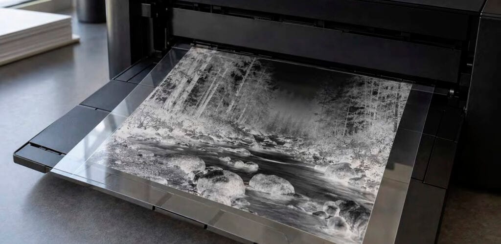
A digital negative is a physical transparency printed from a digital file. It can begin with a digital camera image or a scan of an existing film negative. The final cyanotype, salt print, or other alternative print is still exposed and processed by hand.
Inkjet negatives render tones through patterns of tiny ink dots. These can reproduce smooth-looking gradation at normal viewing distances, but nozzle problems, visible dot structure, and banding can affect the result.
Step by step
- Prepare a clean positive image. Scan film if necessary. Remove dust, crop, and make expressive tonal adjustments before preparing the negative output.
- Set the physical image size. As a starting example, an 8 × 10-inch image at 300 pixels per inch needs 2400 × 3000 pixels. Printer dot resolution is a separate specification.
- Use compatible inkjet transparency film. Confirm the printable side and use material suitable for alternative-process negatives.
- Check the printer. Run a nozzle check. Record media, quality, ink, and color-management settings; automatic changes can invalidate calibration.
- Establish an output calibration. Test the usable density range and tonal response for the exact paper, sensitizer, light source, ink, and transparency combination.
- Prepare the negative file. Apply the process correction, inversion, and any ink-color treatment in the order specified by the calibration method. A curve intended for a positive file is not interchangeable with one intended for a negative.
- Check orientation and scale. Mirror the output as required so the final print reads correctly with ink facing the coating. A small asymmetric test mark helps. Turn off unintended “fit to page” scaling.
- Print, cure, and test. Allow the ink to dry and stabilize according to the material guidance. Contact-print a test before producing an edition.
Keep an unaltered positive master and save the negative output separately with its settings. This makes it easier to print the same photograph through another process later.
Why inversion alone is not enough
The printer and photographic coating do not necessarily translate equally spaced file values into equally spaced print tones. A process correction redistributes those values so the final print retains useful separation.
First establish a practical printing exposure through clear film base. Then verify sufficient UV blocking for light print values. Finally, evaluate and correct the middle tones using a printed step target. Keep test and image output settings identical, and judge dry prints. Mike Ware’s Preparation of Digital Negatives explains these relationships; its software instructions are historical. Richard Boutwell’s digital-negative workflow overview also identifies base exposure, blocking density, and tonal calibration as separate controls.
There is no universal ink color or Photoshop curve for every printer and process. A borrowed curve is a starting point to verify, not a guarantee.
The final contact-printing steps
HOW A CONTACT PRINT IS EXPOSEDSide view • layers separated here for clarityUV LIGHT SOURCEGlass that transmits useful UVNegative baseEmulsion or dry ink faces paperLight-sensitive coating faces upPaperFirm backing / contact pressureIn use, the image layer touches the coating.Good contact preserves detail. Damp coatings can damage a negative.8 × 10-inch negative image = 8 × 10-inch contact imageThe image-bearing side faces the sensitized paper. Layers are separated in this schematic for clarity.
- Prepare the paper. Coat and dry it as required by the process. Keep coating, humidity, and drying conditions consistent.
- Inspect the sandwich. Remove dust from the glass and negative. Place the film emulsion or dry ink layer toward the sensitized surface.
- Secure even contact. Close the contact frame or use an appropriate contact-printing system without shifting the image.
- Expose under controlled conditions. Keep lamp distance fixed. Sunlight varies with weather, season, and time, so a previously successful duration may need adjustment.
- Process for the actual method. Cyanotype is washed; traditional developed-out platinum/palladium uses development and clearing; silver-based methods such as salt and Van Dyke brown need their prescribed fixing and washing.
- Evaluate after drying. Compare shadow separation, midtones, and highlight detail. Record what changed before repeating the test.
Follow the chemistry’s safety instructions and shield UV equipment from direct eye and skin exposure. Avoid pressing valuable negatives against damp coatings.
Match the negative to the process
| Printing method | What to test |
|---|---|
| Cyanotype | Blue shadow separation and delicate highlights; changing formula or paper can change the needed negative response. |
| Salt and Van Dyke brown | Tonal scale after complete processing and drying, including any toning used routinely. |
| Platinum/palladium | Density range and midtone placement for the specific sensitizer, paper, and processing conditions. |
| Gum printing | Each pigment/coating combination and the intended number of layers; multicolor work also needs accurate registration. |
These methods normally use negatives. Anthotypes usually use positive transparencies because exposure bleaches the uncovered pigment. Photograms need objects rather than negatives, and wet plate collodion is primarily a camera-plate process.
Common problems and what to check
| Problem | Check first |
|---|---|
| Weak, pale print | Exposure, coating performance, and excess overall negative density. |
| Highlights print too dark | Overexposure or insufficient blocking in dense negative areas. |
| Good dark tones but empty highlights | Excessive negative contrast or overly strong digital correction. |
| Muddy middle tones | Negative contrast, calibration, and consistency of the printing chemistry. |
| Soft detail | Contact, image-layer orientation, source resolution, or copying focus. |
| Lines or repeating bands | Inkjet nozzle/feed problems; distinguish these from coating streaks. |
Which route should you choose?
Use camera film when you already have a suitable negative at the desired size. Use a darkroom copy negative when optical enlargement and film processing are part of your practice. Use an inkjet negative when you want flexible sizing, local edits, and reusable output settings from digital images or scans.
A useful first comparison is to print the same image by two routes, at the same size, on the same paper and chemistry. Optimize each negative for that process, then compare the finished prints under the same light. Look for detail, tonal separation, texture, and the amount of work needed to repeat the result.