How to Print Matte Sheet Paper with an Epson Printer
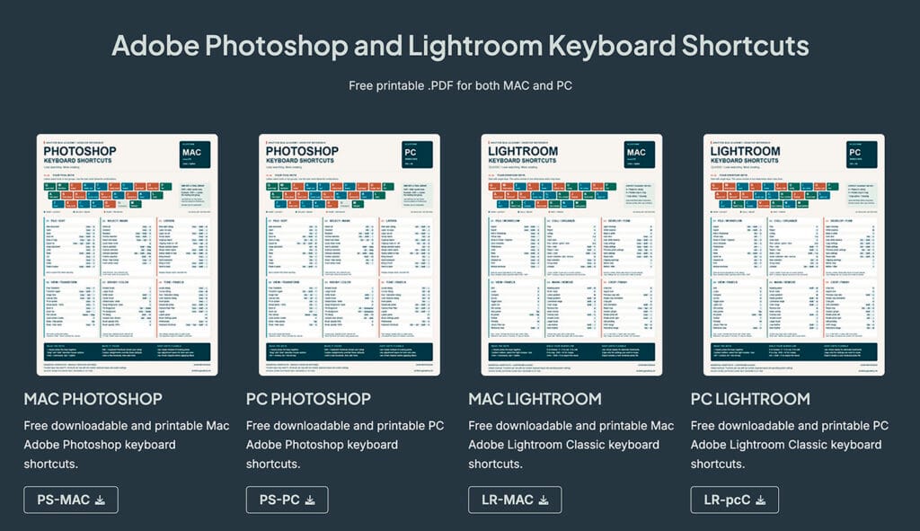
Free Downloadable.pdf guide for printing with Epson Drivers and Printers.
Matte paper gives prints a soft, glare-free, fine-art look, and it’s a favorite for landscapes, black-and-white work, and gallery-style pieces. The Epson SureColor P5000, with its UltraChrome HDX pigment inks, is a great printer for it. Pairing it with Epson’s own matte papers also makes life easier, because the printer, paper, and ICC profiles are all designed to work together.
This post covers the general concepts behind a good matte print. The video above shows the full workflow from Photoshop to the finished print.
Start with a Calibrated Monitor
Before you think about ink or paper, make sure your monitor is telling you the truth. If your screen is too bright, too warm, or too saturated, you’ll edit to compensate, and your prints will never match what you thought you were making.
Monitor calibration uses a small colorimeter that sits on your screen and measures what it displays. Software then builds a profile that corrects your monitor to a known standard. I use the Datacolor Spyder, and I’ll link to my full post on it below.
A few general tips:
- Calibrate on a regular schedule, roughly once a month, since monitors drift over time.
- Let the monitor warm up for 20 to 30 minutes before calibrating.
- Keep your room lighting consistent. A dim, neutral room is ideal, and direct light on the screen will throw off your judgment.
- For print work, a lower brightness target than you’d use for everyday computing helps your screen match a print under normal light. The Spyder software can guide you on this.
Why Matte Paper Behaves Differently
Matte paper has a lower maximum black density than glossy or luster paper. Ink sits in a textured, uncoated surface rather than under a glossy layer, so blacks look softer and colors are slightly less punchy. That’s part of the appeal, but it means a matte print will look flatter than your bright, backlit monitor. Expect a small drop in contrast and saturation, and consider that when editing.
Matte Black vs. Photo Black Ink
Epson printers like the P5000 use two kinds of black ink: Photo Black for glossy and luster papers, and Matte Black for matte and fine-art papers. Matte Black gives a deeper, cleaner black on matte stock, while Photo Black tends to look weak and blotchy on it. The P5000 uses a shared slot for these two inks, so changing between them is done through the printer’s maintenance menu and uses some ink to flush the lines. If you print on both types of paper, it’s worth batching your matte prints together instead of switching back and forth. Check your manual for the exact process on your firmware.
ICC Profiles and Color Management
An ICC profile describes how a specific printer and paper combination reproduces color. It’s what lets Photoshop translate your image so the print matches what you see on screen. One of the best things about using Epson paper on an Epson printer is that the profiles install automatically with the printer driver, so there’s nothing extra to track down.
The golden rule is to let only one program manage color. Whether Photoshop or the printer driver does it, never both. Double color management is the most common cause of prints that look too dark, too saturated, or have a strange color cast.
Soft Proofing
Soft proofing in Photoshop previews how your image will look on a particular paper before you waste any ink. It simulates the paper’s limited contrast and color range right on your calibrated screen, so you can make small adjustments in advance. It’s one of the most useful habits you can build, especially with matte paper, where the difference between screen and print is most noticeable.
Matching Paper, Media Type, and Profile
Epson’s drivers offer a specific media type for each paper, such as Archival Matte or Premium Presentation Matte, and the profile you choose should match the paper you’ve loaded. A mismatch here changes how much ink is laid down and how the print looks, so double-check it any time you change paper.
Handling and Drying
Matte inks are more easily scuffed than glossy ones, so handle prints by the edges, and use clean, lint-free cotton gloves if you like. Give prints time to dry before stacking or framing them. A few hours is a good rule, and longer if the print will go under glass. Store finished prints flat, with acid-free interleaving paper if you’re stacking them.
Common Problems
- Weak blacks: Check that Matte Black is installed and the right media type is selected.
- Off colors: Look for double color management, and confirm the profile matches your paper.
- Prints look too dark: Matte paper absorbs more ink, so soft proof and make a small brightness adjustment.
- Banding or streaks: Run a nozzle check and head cleaning.
Final Thoughts
Good matte prints come down to a few fundamentals: a calibrated monitor, the right ink, a matching profile and media type, and one program handling color. Get those right and the results are consistent and repeatable. If you’d like to see how all of this comes together in practice, watch the video above, and check out my post on calibrating your monitor with the Datacolor Spyder.