Photoshop Info Panel: Stop Guessing About Highlights, Shadows, and Color
By John Whitehead | Shutter Bug Academy | Free Printable Guide Below
The Photoshop Info panel is one of the most important tools I use for accurate editing. It tells me what is happening inside the image instead of making me depend entirely on how the photograph looks on my monitor.
A white shirt can look bright while still holding texture—or look almost identical after its detail has disappeared. A black jacket can look rich and deep while retaining the weave of the fabric—or become a solid dark shape. A gray wall might appear neutral on your screen even though the image contains a color cast.
The numbers help you recognize the difference.
My preferred setup combines an RGB readout using the familiar Light 0–255 scale with a Grayscale readout showing a percentage of black. I use these readings to protect bright whites around 2-3%, keep important dark tones around 97–98% black when appropriate, and check whether supposedly neutral areas actually are neutral.
Download the Free Printable Guide
Images is size at 8.5 X11 inches at 300ppi & uses the Adobe RGB (1998) color profile
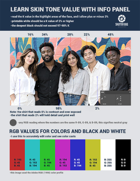
These are working guides, not rules every photograph must obey. The purpose is to make intentional decisions about tone and color.
1. What the Info panel actually measures
The Info panel displays numerical information about the area under your pointer. With the Color Sampler tool, it can also track fixed locations while you edit. Open it through Window > Info.
Think of three tools working together:
| Tool | What it helps you judge |
|---|---|
| Your image preview | Composition, mood, color relationships, and visible texture |
| Histogram | How tones are distributed throughout the image |
| Info panel | The values at a specific sampled location |
The histogram might suggest that highlights are reaching the end of the tonal scale. The Info panel helps answer the more useful question: Is that happening in the texture of the white dress, or only in a small reflection that I am happy to let go white?
The panel is a measuring instrument. It does not correct the photograph by itself.
2. Why it helps when your monitor is not calibrated
A monitor can be too bright, too dark, too blue, or too warm. Room lighting and automatic display adjustments can further influence your judgment.
If your screen is too bright, you may darken a photograph until it looks right on that screen. If the screen has a blue cast, you may add warmth to compensate, introducing an unwanted cast into the file.
The Info panel provides a useful reference that does not change simply because you change your monitor’s brightness. A sampled RGB value of 128, 128, 128 remains the same document value even if your screen makes it look too warm or too cool. However, when the RGB values are exactly the same, that location is neutral gray.
The panel does not replace monitor calibration and profiling. Numbers cannot tell you whether the whole photograph feels balanced or accurately show how subtle color relationships will appear in a print. I always recommend a calibrated, profiled monitor for critical editing.
Use the numbers to check your visual judgment. Use a calibrated display to improve that judgment.
3. Set up RGB and Grayscale together
- Open a photograph in Photoshop on desktop.
- Choose Window > Info.
- Open the Info panel menu and choose Panel Options.
- Set the First Color Readout to RGB Color.
- Set the Second Color Readout to Grayscale.
- Confirm the settings.
- Use the small eyedropper/readout menu in the panel to select the 8-bit value display for RGB when needed.
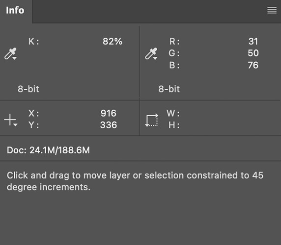
Adobe allows two simultaneous color readouts and provides different numerical display depths. Interface wording can vary slightly with the installed version.
This setup gives you two views of the same sampled area: RGB helps evaluate individual channels and color balance, while Grayscale provides a convenient tonal percentage.
Changing the readout to Grayscale does not convert your photograph to black and white. It changes the measurement display. Do not choose Image > Mode > Grayscale just to obtain this information.
An 8-bit readout does not require an 8-bit file
The document’s bit depth and the Info panel’s display scale are separate choices. You can keep a 16-bit-per-channel working file and use the convenient 0–255 readout. Adobe documents 8-bit, 16-bit, and 32-bit Info displays.
Work in 16-bit when appropriate for substantial tonal and color editing. There is no reason to discard that precision just to make the numbers easier to read. An 8-bit display rounds the measurement to its coarser scale; it does not show every distinction present in a 16-bit file.
This article’s endpoint examples concern ordinary SDR editing. A 32-bit HDR document can contain values beyond the standard display-white range and needs a different interpretation.
4. Understand the RGB scale
RGB describes the red, green, and blue components of a pixel. In the 8-bit readout, each channel runs from 0 to 255.
| Example RGB reading | Meaning in a standard RGB working space |
|---|---|
| 0, 0, 0 | Black endpoint |
| 25, 25, 25 | Dark neutral gray |
| 128, 128, 128 | Neutral gray near the numerical middle of the scale |
| 220, 220, 220 | Light neutral gray |
| 248, 248, 248 | Very bright neutral tone below the white endpoint |
| 255, 255, 255 | White endpoint |
These are illustrative values, not exposure assignments for particular objects. RGB 128 is not automatically an 18% gray card reading, half the scene’s light, or the correct target for every middle-gray subject. RGB encoding is not a linear exposure scale.
Also, RGB numbers depend on the document’s color profile. The same unequal RGB triplet can describe different colors in sRGB, Adobe RGB, and ProPhoto RGB. Preserve appropriate embedded profiles, and compare images in a consistent color-managed workflow.
5. Understand the Grayscale percentage
The Info panel’s Grayscale readout uses a black-percentage scale:
| Grayscale reading | Tonal interpretation |
|---|---|
| 0% black | White end of the scale |
| Low percentage | Light tone |
| 50% black | Middle of this percentage scale |
| 97–98% black | Very dark tone near the black end |
| 100% black | Black end of the scale |
The direction is the opposite of the RGB scale: higher RGB values are lighter; higher black percentages are darker.
The K label used for this grayscale percentage does not make it the black-ink channel of a CMYK separation. It also is not a direct measurement of ink coverage on your finished photograph.
Avoid treating Grayscale percentages as universal equivalents of particular RGB triplets. A grayscale interpretation can depend on Photoshop’s color settings and gray working space. In particular, do not assume that 97–98% black always equals one fixed RGB range across different workflows. Use the actual paired readings in your document.
Percentages are also rounded. A displayed 100% or 0% is a reason to inspect more closely, not sufficient proof by itself that all source-channel information has reached an endpoint.
6. Bright whites without losing texture
A bright white subject does not need to be solid 255, 255, 255 to look white. White fabric, clouds, snow, and pale flowers need small tonal differences if their texture is supposed to remain visible. I try to hold almost anything in the image 2% or hight to retain some detail. 0% is pure white.
For a demonstration, roughly 5% is a useful starting region for a bright, textured highlight. It is not a universal output requirement. Some pictures need lower values, and some bright detail can extend above this range.
The essential question is whether the highlight still contains meaningful variation.
A practical highlight workflow
A practical highlight workflow
- Find a bright area where texture matters.
- Place a Color Sampler on a representative part of it.
- Add a Curves adjustment layer.
- Adjust the upper tones while watching the sample and the photograph.
- Check several nearby areas rather than relying on one point.
- Inspect at 100% and use clipping previews and individual-channel histograms as additional checks.
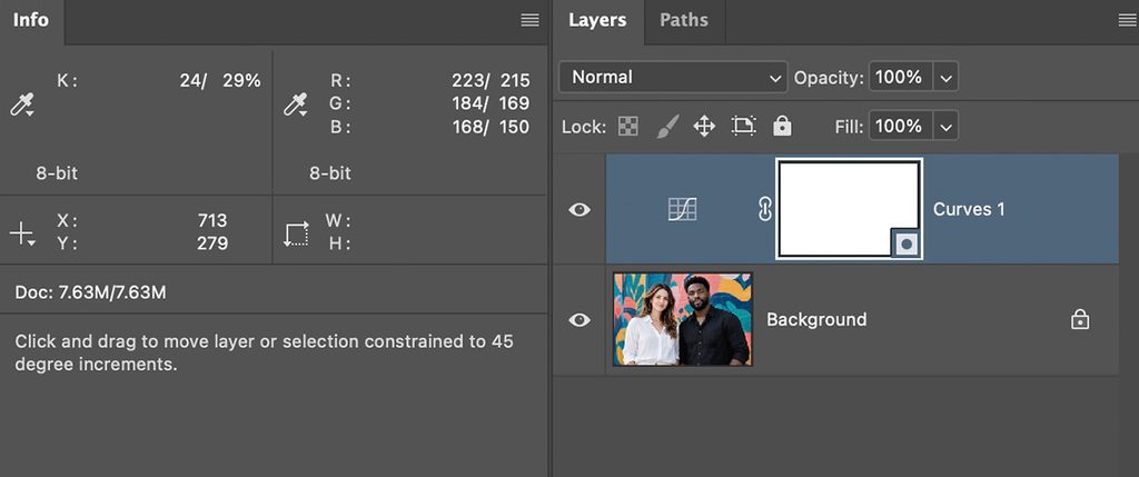
- Note: in this example there are two values for both K and RGB. The first for K: 24% this is what the image was before the Curves Adjustment. The second K: 29% is after the adjustment.
Watch individual channels
A reading such as 255, 246, 238 has reached the red-channel endpoint even though it is not pure white. It may signal red-channel clipping; inspect the surrounding area and channel histogram. One endpoint sample alone cannot establish whether meaningful detail was lost.
An average of 248 can also conceal some individual pixels at 255. Use a smaller sample or Point Sample when investigating a suspected clipped patch.
Some pure whites are appropriate
Small specular reflections, visible light sources, and deliberately white backgrounds may reasonably reach pure white. Protect meaningful subject detail; do not make every sparkle dull simply to avoid an endpoint.
7. Deep blacks around 97–98%
For important shadow areas, I often use 97–98% black as a working reference. It helps me keep a black subject looking deep without automatically pushing it to the bottom of the scale. In my opinion setting pure black 100% and pure white 0%is not going to result in a well edited image. This is why I NEVER auto tone anything!
This is particularly useful with dark clothing, black feathers, dark hair, and shaded surfaces where I want to retain texture.
But a safe-looking number does not guarantee detail. A flat patch that reads 98% everywhere is still flat. Texture requires differences between neighboring tones, and those differences must survive the intended display or printing process.
A practical shadow workflow
- Identify the darkest area where detail is important.
- Place a sampler on representative texture, not the deepest empty gap.
- Watch the Grayscale percentage while adjusting the lower portion of a Curves adjustment layer.
- Use 97–98% as an initial reference when it suits the photograph.
- Inspect nearby tonal separation and check the RGB channels.
- Evaluate the output. For prints, use the correct paper/printer profile, soft proofing, and a test print when the result matters.
You do not have to eliminate every true black. Deep crevices, silhouettes, and backgrounds may intentionally have little or no detail. Conversely, some shadow texture may need to be much lighter than 97–98% to reproduce clearly on a particular paper.
Lifting black does not recover missing detail
If an area has already been flattened to a uniform black value, raising it makes a lighter uniform patch. The same is true when lowering an already flat white patch.
Return to the raw file or an earlier editing stage if recoverable information exists there. The Info panel can help prevent further loss; it cannot reconstruct information that is gone.
8. Use RGB to recognize a neutral gray
In standard RGB working spaces such as sRGB, Adobe RGB, and ProPhoto RGB, a neutral tone has equal red, green, and blue values.
Neutral does not mean only middle gray. A dark gray, light gray, or near-white tone can also be neutral. Anytime all three numbers are the same, you have a neutral gray.
| Illustrative reading | Interpretation |
|---|---|
| 65, 65, 65 | Dark neutral gray |
| 128, 128, 128 | Middle neutral gray |
| 210, 210, 210 | Light neutral gray |
| 150, 140, 130 | Warm/red-yellow bias |
| 130, 140, 150 | Cool/blue-cyan bias |
| 130, 150, 130 | Green bias |
| 150, 130, 150 | Magenta bias |
These examples describe channel relationships, not measured amounts of correction. A small mismatch may be insignificant because of texture, noise, or rounding. Do not ruin the photograph to make every sample mathematically identical.
Sample something that should be neutral
An RGB mismatch is evidence of color at the sampled location. It is evidence of an unwanted cast only if you have a reason that location should be neutral.
A gray reference card under the subject’s illumination is useful. A random wall, white shirt, cloud, or sheet of paper may contain its own tint or reflect colored light. Skin is not neutral and should not have equal RGB values.
Even a truly neutral object can look warm under sunset light or blue in open shade. Decide whether your goal is neutral reproduction or preservation of the scene’s atmosphere.
9. Correct a cast while watching the numbers
For an overall white-balance problem in a raw photograph, start with white balance in Camera Raw or Lightroom when possible. In Photoshop, a Curves adjustment layer gives you control over the individual RGB channels.
Method A: use the gray eyedropper
- Add a Curves or Levels adjustment layer.
- Select its gray-point eyedropper. (This rarely works well unless it is close)
- Click a reliable, unclipped area that should be neutral.
- Check the sampler readings and the rest of the image.
- Undo and choose a better reference if the result looks wrong.
Adobe provides black-, gray-, and white-point eyedroppers for tonal and color correction. The gray eyedropper neutralizes the selected color; it does not mean every sample should become RGB 128.
Method B: adjust individual Curves channels
Imagine a known neutral reference reads 150, 140, 130. As a teaching example, you could move red down toward 140 and blue up toward 140, leaving green as the reference.
In the ordinary RGB light-value Curves view:
| Channel | Moving the curve up | Moving the curve down |
|---|---|---|
| Red | More red | More cyan |
| Green | More green | More magenta |
| Blue | More blue | More yellow |
Watch the actual sampler response rather than assuming a particular curve movement will produce an exact result. Adjustments also affect other tones. Check a highlight, a midtone, and a shadow after the correction.
A single correction may not fix mixed lighting. A room illuminated by daylight and warm lamps can contain different casts in different areas. Use masks for local corrections when necessary.
10. Get reliable samples
The Eyedropper is useful for live inspection. The Color Sampler places fixed measurement points that remain available while you work. Adobe documents sample-size options and per-sampler color readouts.
For ordinary photographs, start with 5 by 5 Average or 3 by 3 Average. These reduce the influence of a single noisy pixel. Use Point Sample to investigate exact pixel values, and larger averages cautiously: they can combine different surfaces and conceal local extremes.
Place three purposeful samples:
- A bright textured highlight.
- A dark textured shadow.
- A reliable neutral reference, if one exists.
Keep the averaging area inside the material you intend to measure. A sample that straddles white fabric and a dark background will measure a mixture.
Where your sampling tool offers a layer-source menu, check whether it is reading the current layer or the combined visible result. When evaluating the finished appearance, include the adjustments you intend to measure. A hidden layer, isolated channel, or selected mask can lead you to inspect something other than the intended color image.
With the Color Sampler tool active, move sample markers to reposition them, or use its clear control to remove them. Each sample can have its own readout mode. [2]
11. Common mistakes
| Mistake | Better approach |
|---|---|
| Converting the file to 8-bit to get 0–255 readings | Change the readout scale and preserve working precision |
| Treating 97–98% black as mandatory everywhere | Apply it as a starting point to selected shadows where detail matters |
| Assuming 248 means every nearby pixel is safe | Inspect smaller samples and channel clipping |
| Neutralizing a naturally colored surface | Use a reliable neutral reference |
| Sampling a blown highlight for white balance | Use an unclipped reference with usable channel information |
| Raising a flat black patch and calling it recovered detail | Return to an earlier source if detail exists there |
| Comparing RGB values without considering profiles | Keep color management consistent |
| Trusting three sample points to represent the entire image | Inspect the photograph and histograms as well |
13. A simple demonstration to follow along
Photograph a still life containing textured white fabric, textured black fabric, a neutral gray card, and a colored object. Illuminate them with the same light source and expose carefully enough to retain both highlight and shadow information.
Open the image and set RGB and Grayscale readouts. Place samples on the white fabric, black fabric, and gray card.
First, brighten the photograph until the white fabric starts to lose separation. Show both the numerical changes and the flattening texture. Undo the adjustment and bring the bright fabric into a useful range while preserving differences between folds.
Next, deepen the shadows. Show what happens when the black fabric becomes a flat shape. Then use the 97–98% black reference as a starting point and inspect whether the weave still separates.
Finally, deliberately introduce a color cast with a temporary adjustment layer. Show how the gray card’s RGB channels separate. Remove the cast and show the channels moving back toward equality.
This exercise demonstrates the real value of the panel: you can connect a number to a visible change and make a more informed editing decision.
Make the numbers part of your normal workflow
Keep the Info panel open while you edit. Check important highlights before they lose texture. Check deep shadows before they merge together. Check a known neutral reference before deciding that the color is correct.
The goal is not to make every photograph fit the same numerical recipe. It is to understand what your edits are doing, preserve the detail that matters, and decide deliberately when pure white, deep black, or a color cast belongs in the image.
Suggested internal links: Photoshop keyboard shortcuts page, color management tutorial
Adobe references
These references support the Photoshop controls and color-management concepts. Sample numbers, exercises, and the 97–98% shadow target are teaching examples and working preferences, not Adobe-prescribed output standards.