Why You Should Never Blindly Use Auto Tone in Adobe Photoshop
By John Whitehead | Shutter Bug Academy
Auto Tone can make a photograph look more dramatic with one click. Shadows become darker, highlights become brighter, and the image appears to have more contrast. But a more dramatic photograph is not necessarily a better photograph.
That quick adjustment can also sacrifice delicate highlight detail, deepen shadows too aggressively, and change the color of the light you worked to capture.
My advice is simple: never let Auto Tone make the final decision about your photograph. Learn to read your image, measure important areas with the Info panel, and use Curves or Levels to make intentional adjustments.
Auto Tone sometimes produces a useful starting point. The problem is treating its result as a technically correct answer.
What Auto Tone Actually Does
Photoshop’s Auto Tone adjusts the red, green, and blue channels independently, expanding their tonal ranges. With standard settings, the correction uses black and white targets and clips a small percentage of the darkest and lightest values. Adobe identifies the default clipping amount as 0.1% at each end.
Because each channel receives a different adjustment, Auto Tone can remove an unwanted color cast—or introduce an unwanted color change. Its behavior also depends on saved correction settings.
Photoshop can analyze pixel values. It cannot decide whether the warm light on a face is the reason you made the photograph.
Imagine photographing a quiet landscape in morning fog. The soft contrast creates depth and atmosphere. Expanding that photograph toward deep blacks and brilliant whites may make it appear punchier while weakening the feeling of fog.
The photograph’s tonal range should serve the subject and the light.
Understanding 0, 0, 0 and 255, 255, 255
Using the familiar 8-bit RGB scale, each pixel has a red, green, and blue value between 0 and 255.
| RGB reading | Meaning |
|---|---|
| 0, 0, 0 | Pure black |
| 12, 12, 12 | A very dark neutral gray |
| 128, 128, 128 | A middle RGB code value—not necessarily photographic middle gray |
| 245, 245, 245 | A very light neutral gray |
| 255, 255, 255 | Pure white |
These examples use an 8-bit-style readout for clarity; you do not need to convert a 16-bit photograph to 8-bit to make tonal adjustments.
A region consisting entirely of 0, 0, 0 has no tonal variation within it. The same is true of a region consisting entirely of 255, 255, 255.
That matters when the region is supposed to contain texture. A white shirt needs differences in tone to reveal its weave and folds. Dark hair needs differences in tone to reveal individual strands.
If an adjustment pushes those differences into one uniform endpoint, the texture disappears.
Your Photograph Does Not Have to Reach Both Extremes
There is no requirement that every photograph contain pure black and pure white.
Consider these situations:
- Fog: Deep blacks may undermine the soft atmosphere.
- A portrait against a pale background: There may be no reason for a true black.
- A dim interior: The brightest object may still be relatively subdued.
- Snow under overcast light: Subtle highlight differences can matter more than brilliant white.
- A scene made of muted colors: Forcing a full tonal range may exaggerate contrast beyond your intention.
A histogram that stops short of one or both edges is not automatically a problem.
Equally, pure black and pure white are not automatically mistakes. A silhouette, a tiny sun reflection, or an intentionally white product background may justify those values.
The useful question is: Does this area need detail, and does its brightness make sense in the photograph?
Most photographs do not need their important shadow and highlight detail forced to absolute black and white. That is a more useful principle than banning those values altogether.
How Auto Tone Can Change Color
Suppose you photograph someone near sunset. The light is warm, so a pale shirt may contain more red than blue. That difference can be an accurate description of the lighting.
Independent channel adjustments can change that relationship.
Possible consequences include cooler skin, altered shadow color, or reduced warmth in a sunset. These are examples of what can happen, not guaranteed results on every photograph.
It also helps to distinguish Photoshop’s automatic commands:
| Command | Basic approach |
|---|---|
| Auto Tone | Adjusts channels independently; can change color balance |
| Auto Contrast (I like this better than auto tone) Image/Auto Contrast | Adjusts overall contrast without independently stretching each channel |
| Auto Color | Attempts to correct color casts as well as tone |
The Auto button inside Curves or Levels can use different algorithms, so it does not always mean the same thing as Image > Auto Tone.
A neutral-looking result is not necessarily a faithful result. Warm light, cool shade, and colored reflections belong in many photographs.
Use the Info Panel to Measure What You Are Editing
Your monitor shows an interpretation of the image. Screen brightness, room lighting, and surrounding colors influence your judgment.
The Info panel gives you numerical evidence to use alongside your eyes.
Set up your readings
- Choose Window > Info.
- Select the Color Sampler Tool, grouped with the Eyedropper.
- Set its sample size to an average, such as 5 by 5 Average, for a more representative reading than a single pixel.
- Place samples on an important textured highlight, a detailed shadow, and a known neutral area if one exists.
- Set the sample readouts to RGB Color.
- Watch the values while adjusting Curves or Levels. Photoshop can show before-and-after readings during adjustments.
Keep your sample area inside the feature you want to measure. A sample straddling white fabric and a dark background gives you a mixture of both.
Averaging is useful for representative tones, but it can hide isolated clipped pixels. Use clipping previews and individual channel histograms when checking the extremes.
Interpret the numbers in context
These hypothetical readings illustrate how to think about a sample:
| Sample | Reading | What to investigate |
|---|---|---|
| White fabric | 244, 243, 240 | Bright, slightly warm; inspect nearby values for texture |
| White fabric | 255, 255, 255 | At the white endpoint; check whether important texture has clipped |
| Dark jacket | 14, 17, 21 | Dark and somewhat blue; this may fit the lighting |
| Known neutral gray | 145, 132, 119 | Warm rather than neutral; decide whether that warmth belongs |
One sample cannot prove that an entire area contains good detail. Look for variation across neighboring areas.
Also, unequal RGB values are not automatically a color problem. They are expected in colored objects and can be appropriate in neutral objects illuminated by colored light.
The Info panel measures the result. You decide whether the result is right.
Set the targets
- Create a Curves or Levels adjustment layer.
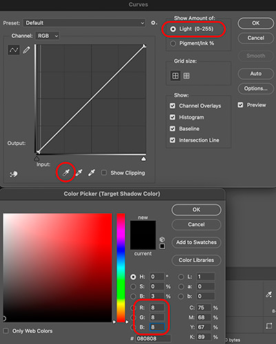
- Double-click the black-point eyedropper.
- Enter a custom neutral shadow target—for example, R: 8, G: 8, B: 8. This will give you 97% K.
- Confirm the color.
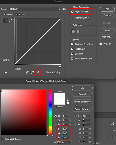
- Double-click the white-point eyedropper.
- Enter a custom highlight target—for example, R: 248, G: 248, B: 248. This will give you 3% K.
- Confirm the color.
- Use each eyedropper on an appropriate shadow or highlight reference in the photograph.
These numbers are examples, not universal settings. Some photographs need a wider range; others need a much softer one.
Changing the target alone does not correct the photograph. Clicking with the eyedropper applies the mapping.
Choose your reference carefully. Clicking a dark blue jacket with a neutral black target can change the color balance. Clicking an ivory wall with a neutral white target can remove its intended warmth. If suitable references are absent, use manual tonal controls instead.
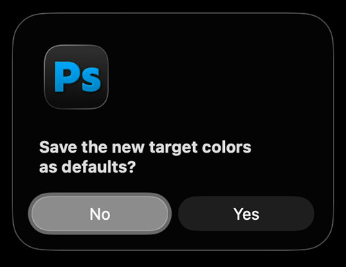
Do not automatically save image-specific targets as defaults for every photograph.
Control the Tonal Range Manually in Levels
Levels separates Input Levels from Output Levels.
Input controls determine which source values become the shadow and highlight endpoints. Output controls determine how dark and bright those endpoints become.
For example, moving the black input to 20 with the default black output of 0 maps values of 20 and below to 0. Moving the white input to 240 with the default white output of 255 maps values of 240 and above to 255.
To experiment with softer endpoints:
- Add a Levels adjustment layer.
- Leave the RGB input endpoints at 0 and 255 initially.
- Set the Output Levels to 10 and 245.
- Adjust the middle input slider as needed.
- Watch your samples and inspect the photograph.
Hold Option on Mac or Alt on Windows while dragging the input endpoint sliders to preview clipping.
Output compression can soften an image, but it does not restore lost detail. A flat white patch changed from 255 to 245 becomes a flat light-gray patch.
Control the Endpoints in Curves
Curves provides more flexibility when different tonal areas need different treatment.
- Create a Curves adjustment layer.
- Select the RGB composite curve.
- Use the Light (0–255) display.
- Select the lower-left endpoint. Keep Input at 0 and try Output at 10.
- Select the upper-right endpoint. Keep Input at 255 and try Output at 245.
- Add gentle interior points to refine shadow, midtone, or highlight contrast.
- Monitor the Info panel as you work.
Moving endpoints vertically changes the output range. Moving them inward horizontally can clip source values. Those are different operations.
You also do not have to move either endpoint. Sometimes the photograph needs only a small midtone adjustment while its existing shadows and highlights remain appropriate.
If Auto Tone Has Already Gone Too Far
Start by removing or reducing the adjustment that caused the problem.
If Auto Tone was applied directly to the pixel layer, undo it or return to an untouched version when possible. If the correction is in an adjustment layer, disable or revise that layer.
Then make a controlled correction from the preserved image.
Lifting crushed blacks or lowering clipped whites afterward does not reconstruct the differences that were discarded. Keeping an original and working with adjustment layers gives you a way back.
Build a Habit of Looking and Measuring
Before changing contrast, identify what matters: the texture of a white dress, the separation in dark hair, the warmth of evening light, or the softness of mist.
Then use the Info panel to monitor those areas while making small adjustments.
Do not replace one automatic habit with another. Setting every photograph to 10 and 245 is no more thoughtful than setting every photograph to 0 and 255.
Choose the tones that support the photograph. Preserve the detail that matters. Let the numbers inform your decisions without making those decisions for you.